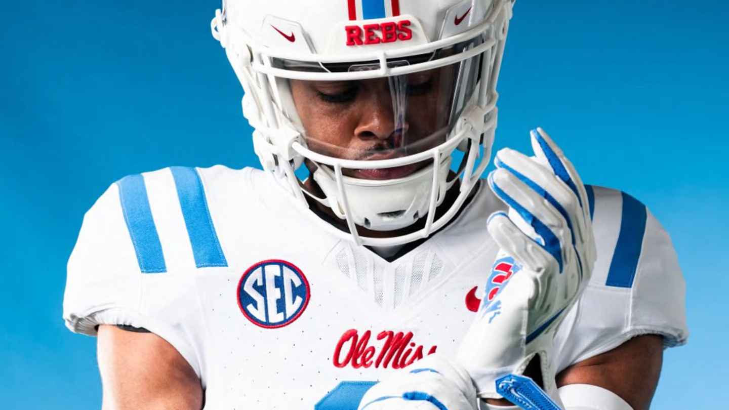
How Good Are Ole Miss’ New Uniforms? A Fresh Spin On Classic Rebels Style

Stop if you’ve heard this before: the Ole Miss Rebels have some new digs.
That has become a common practice since Lane Kiffin arrived as the head coach of the football Rebels, and the new look that was revealed on Monday will be the fifth jersey design that Ole Miss has worn in his tenure. Of course, this paired with two pant styles and four-plus helmet designs (depending on the decals) makes for a multitude of combinations in the uniform department.
“Drip in the Sip,” indeed.
I’ve written previously about Ole Miss’ uniform history and practices. This is one area of sports that has always appealed to me because so much about a team’s identity is wrapped up in its brand. As a child, it was pretty easy to identify who the teams were on television based simply on the uniforms, and while those waters have clouded some in recent years, I still think it’s a pretty good test of when a program is (or is not) drifting too far away from its recognizable brand.
That’s one thing that makes Ole Miss’ uniform expansion so interesting. Don’t get me wrong: I still think the classic threads are the best, including the gray pants, but the Rebels have somehow managed to expand their arsenal without straying from the core designs that made them a recognizable brand across the nation.
Take the usage of powder blue, for instance. Ole Miss has heavily leaned into that look over the last 10 years, and it has become synonymous with the athletic department, in many ways. Even the official Ole Miss Athletics account on X has “Home to The Grove and the original powder blue” in its bio. So, yeah, it’s safe to say that it’s a hit.
And it has its roots in the football helmets of old. Ole Miss managed to take the idiosyncrasy of mismatched blues from decades ago and build it into a pivotal part of its marketing scheme, and Monday was another evidence of that.
That’s a lot of words to get to my main point, but the uniforms are also a hit. The social media reaction (that I saw, anyway) was overwhelmingly positive, and for good reason. This look pops, and it is a unique take on the same style that Ole Miss has used for decades.
It’s currently unclear whether or not this jersey will replace the traditional road look that the Rebels use (white jersey with red accents). If it does, that’s the only real drawback to this release, in my mind. I think eliminating a timeless look is almost always a mistake, but that doesn’t take away from what this actual uniform brings to the table.
It’s fresh, unique and excites the fan base while also holding some notes of tradition. At the end of the day, isn’t that what’s needed?
link


